
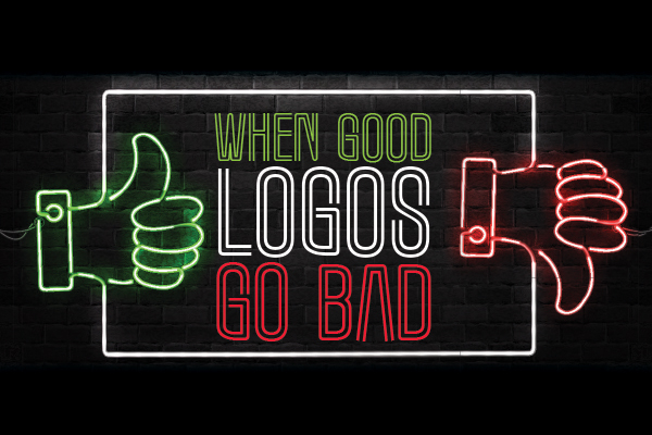
When good logos go bad…and how to get it right!
Bored scrolling through your phone? Check out Logo Quiz on the App Store or Google Play. You’ll be challenged to see if you can identify the brand name behind more than 3000 logos. There are a whopping 52 “exciting levels”. You can amp up the challenge in expert mode, and with every correct guess, you get to learn more about each company brand.
How popular is it? Well, more than 60,000,000 people worldwide have downloaded the game and 1.1 million give it 4.5 stars. That’s pretty darn popular!
As a Marketing Agency, we love this game! It challenges our own knowledge of popular brands but even more so because it screams “logos matter” in a powerful way.
Some people think a logo is simply artwork. But as marketers, we know otherwise. We have a deep understanding of their power to communicate and connect to your customer.
“Research suggests that there’s more to a logo than its basic aesthetic appeal. The study, conducted by an international team of researchers, suggests that people make complex assessments of a company or product based merely on the shape of the logo.” {Source}
Your logo gives visual life to your company story. It identifies your business in the simplest of forms. But it’s far from a simple sketch, it’s filled with meaning and makes the important connection between your company and what your company represents.
Logos can communicate all the right things about your business, or if done poorly, all the wrong things. Sixty million people playing Logo Quiz proves that logos stick in people’s minds!
For fun (and understanding of how every choice matters), let’s look at a few logos gone wrong…
COLOR CHOICE GONE WRONG
FONT CHOICE GONE WRONG
SYMBOLISM GONE WRONG
This doesn’t exactly scream detail right?
And last but certainly not least…
JUST PLAIN WRONG…
There is a great deal of science, strategy, and psychology that goes into the design of a company’s logo. Every choice matters! The font, spacing, color choice, and symbolisms all work together to convey your overall brand message and set you up for success. Or as we can see from the examples above, making the wrong choices can land a company on the list of “worst logos ever” or worse yet, can potentially ruin a company’s reputation.
Obviously, each one of the logos above was approved by someone. Which makes us shake our heads and wonder, “why in the world would someone give those logos a green light?”
Because they don’t know what they don’t know. And possibly they didn’t ask the right people for input or direction.
So, what do you need to know to ensure you are making the best first impression possible with your logo?
First, have a clear brand strategy!
A common misconception is that a company’s logo IS their “branding,” but it’s actually only one element of an overall branding strategy. Your brand is the overarching emotional message you want your customers to perceive. Your logo is a symbol that reflects your brand and provides instant and lasting brand recognition.
Before a company begins creating a logo, it’s important to have a clear, well-developed brand strategy.
An effective brand strategy gives you a major edge in increasingly competitive markets. But what exactly does “branding” mean? Simply put, your brand is your promise to your customer. It tells them what they can expect from your products and services, and it differentiates your offering from that of your competitors. Your brand is derived from who you are, who you want to be and who people perceive you to be.
The foundation of your brand is your logo. Your website, packaging and promotional materials–all of which should integrate your logo–communicate your brand.” {Source}
With a solid brand strategy in place first, your logo can be created as a reflection of who you are. Every choice can then be influenced by the promise you are making to your customer. Ensuring that your logo is consistent with your message serves to strengthen your strategy and build recognition.
Take the Sherwin Williams logo, for example. It’s safe to assume that their overall brand strategy isn’t to send a somewhat sinister message. But in choosing to depict the earth covered in blood-red paint did just that, unfortunately. Yes, they want to paint the earth, but the color choice they made was not in line with the message they wanted to convey.
Every choice matters
The logo fails we highlighted were obviously blatantly wrong. But often we see logos that are poor brand promise communicators in more subtle ways such as:
- The motion or flow of the shapes chosen do not convey growth or upward movement.
- The nuance of the color shade sends the wrong message. Even a shade or two off can change the emotional impact.
- The font choice is either too soft or too strong, so the overall impact is not one of trust.
- The spacing and placement make the logo difficult for the eye to read.
- The logo was created with the wrong resolution settings. Making it difficult to size appropriately for different spaces and does not print well on all identity collaterals.
If even one of those choices is not on-point, the logo sends the wrong message to the consumer. They react by not wanting to look at it, but they aren’t sure why. It just doesn’t “feel right”.
We know there is a ton of options out there for the business owner looking for a new logo. The Do-it-yourself websites and crowdsourcing sites offer low-cost logo creation. When deciding where to go for your logo creation there are some critical questions to ask yourself:
- Do they have a clear understanding of what your business is really about?
- Do they have the expertise to understand the customer base you are trying to reach?
- Do they understand the important correlation between your brand and your logo?
- Do they understand your overall marketing goals?
- Do they fully research your competitors ensuring you will stand out in your market?
- Do they spend the time to get to know you?
- Do they offer feedback, guidance, and direction to help draw out your vision?
- Do they have a proven track record of creating powerful branding strategies and logos?
- Do they have a team of trained eyes to collaborate and ensure all the right choices are made?
- Do they communicate that they truly care about you?
“As a company spends money on advertising to drive in new clients, if the foundation of their marketing is not strong then all that money is wasted. For start-up businesses especially, a substantial amount and variety of advertising initiatives are required to generate the new clientele needed to start strong and build a profitable, thriving, successful business with staying power. A weak brand, identity, logo, and website, which all serve to connect with potential clients will not provide the footing needed to support any successful advertising campaign.” ~Mike Shoun
Much like we trust our bodies and our teeth to doctors and dentists, trusting your logo to a professional is one of the best investments a business can make.
What can you expect to invest in a logo? That can vary as much as different shades of blue – we’ve seen design agencies charge upwards of $50,000.
GOOD NEWS…WE DO NOT CHARGE $50,000!!
Affordable Image wants to be your marketing partner for the life of your business. We don’t want you on the “worst logo ever” list. We want to see you succeed and grow with you. We offer several marketing packages that give you the foundation needed to start strong, we even cover the cost of the logo and website.
Know someone who needs a logo? Are you not part of the Affordable Image family yet? Call us at (800) 639-1622 and we can help you get started before you can say “bad logo”.